Cost to own a car
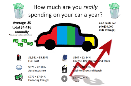
Owning a car has become more expensive over the years. As a college student when I think about owning a car the only cost that factors into it for me is paying for gas; however, there are so many other things factoring into it, making owning a car very expensive. I have chosen to display this by creating a “pie like”chart in the shape of a car to show the distribution of the annual cost of owning a car. The sites that I got the statistics from were both collected in 2010 and based on the average of a small, midsize, and large vehicle. I, however, decided to leave out the cost of value deprecation because I feel that you are not really putting forth that money to pay for maintaining a vehicle each year, but instead it’s the value your car is losing if you ever wanted to sell it. I have given both the annual cost and the cost per mile a car cost. To calculate the average fuel cost I used the current US average for a gallon of gas at $3.56.
The colors filling up the car are represented but the icons below which have the same corresponding colors in them. As for the rest of the graphics I used to add visual appeal to the infrograph. I italicized the word “really” in the title because most people do not factor in all of the cost I have given. The red arrow is casting a shadow of a dollar sign symbolizing that the overall cost of owning a car is going up (gas prices can make this fluctuate up and down). Next, I decided to show dollar bills flowing out of the exhaust pipe to symbolize the amount of money we are losing when we drive our cars. Not wanting to give the impression that owning a car is a waste of your money, I did however put two trashcans full of money at the top of the image. I just want people to realize the amount of money they are spending to maintain a vehicle and hope to persuade people to cut back and think of some alternatives to save money with their transportation choice.
As for Robin William’s four principles, first I tried to keep the contrast simple using a white background with seven additional colors to make the pie chart car. Next, the alignment of the different costs I made into a 3 x 2 easy to read block formation below the chart. I also used alignment and repetition to place the money coming out of the exhaust pipe and the trashcans of money to make the image visually appealing. Finally because I had open space on the bottom right side of the image I added the arrow to balance out the full image, fulfilling the fourth and final principle, proximity.
